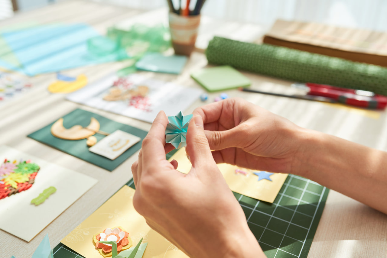
Layering is one of the most transformative techniques in handmade card design. It gives your creations depth, dimension, and a professional finish that makes even the simplest designs appear detailed and artistic. Whether you prefer clean and minimal layouts or rich, decorative compositions, mastering layering opens the door to endless creative possibilities. The key is learning how to balance colors, textures, shapes, and focal points in a way that feels intentional and visually appealing.
Understanding the structure of layered cards begins with envisioning how each element interacts with the next. Instead of placing embellishments randomly, layers should guide the eye, frame your message, and support the theme of the card. When each layer has a purpose, your card becomes a cohesive piece of art rather than a collection of unrelated decorations. This mindset helps you design more confidently and efficiently.
Another important aspect of layering is choosing the right materials. Paper thickness, finishes, fabrics, and lightweight embellishments all play a role in the final effect. Mixing flat and raised elements creates contrast, while alternating textures adds richness. Using foam adhesive or dimensional tape is a simple yet powerful way to lift certain pieces and draw attention to important areas.
Choosing the Right Base Layers
The base of your card sets the foundation for all the layers that follow. Select a sturdy cardstock that holds its shape even when multiple pieces are added. Neutral tones such as white, cream, kraft, or black work well because they complement most styles and color palettes. Consider adding a secondary panel to frame your design—this could be a contrasting color, patterned paper, or a textured sheet like linen or canvas cardstock.
Before attaching anything, experiment by placing panels on top of each other to see how they interact. Pay attention to margins and spacing; even borders help maintain a clean, professional look. A well-structured base instantly elevates the entire design and allows your upper layers to shine.
Playing with Textures and Materials
Texture is essential for creating depth without overcrowding your card. Mix materials with different tactile qualities to achieve balance. Smooth cardstock pairs beautifully with embossed papers, while lightweight fabrics such as lace, ribbon, or tulle add softness. Patterned papers introduce visual texture and can become subtle background layers that support your theme.
For a more dynamic look, incorporate handmade textures. Dry embossing creates raised patterns, while ink blending adds gradient color transitions that look sophisticated and artistic. Lightly distressing the edges of your paper layers gives your card a rustic and handcrafted touch. The trick is to use texture thoughtfully, ensuring each choice enhances rather than distracts from the focal point.
Adding Dimension with Adhesives
Dimensional adhesives are a must for professional-looking layers. Foam squares, foam tape, and double-sided adhesive create varying heights that give your card a three-dimensional structure. By lifting certain pieces—such as sentiment strips, focal images, or decorative clusters—you create shadows that instantly make your design more dynamic.
Varying the height of layers prevents your card from looking flat. For example, a background panel may lie flat on the card base, while the main artwork is raised slightly. Smaller decorative elements can be lifted even higher to create a gradual, visually interesting structure. Experiment with different heights to find the perfect balance.
Balancing Colors, Shapes, and Patterns
Color harmony is crucial in layered card design. Choose a palette of three to four colors that complement each other and repeat them throughout your layers for consistency. Too many colors can feel chaotic, while too few may lack interest. Patterns should vary in scale: combine large patterns with smaller ones to create contrast without overwhelming the eye.
Shapes also affect balance. If your card includes many sharp angles, soften them with rounded corners or circular elements. Repeating a shape or motif—such as hearts, leaves, or stars—helps unify the design. Every layer should relate to the others, whether through color, shape, or theme.
Creating Focal Points and Supporting Layers
A strong focal point is essential when building layered cards. This can be an illustration, die-cut, sentiment, or decorative cluster. Supporting layers should frame or highlight this focal element, guiding the viewer’s eye toward it. Use contrasting colors or raised layers to make the focal point stand out.
Avoid adding too many competing elements around the focal point. Instead, allow negative space to do some of the visual work. Clean, open areas help the design breathe and prevent clutter, making the layered composition feel intentional and refined.
Enhancing Layers with Embellishments
Embellishments bring personality and charm to your layered cards, but they must be used thoughtfully. Small accents like pearls, enamel dots, sequins, or paper flowers can highlight specific layers and add sparkle or softness. Place them strategically—perhaps along the edge of a raised panel, around a sentiment, or inside a decorative cluster—to reinforce your design.
Handmade embellishments, such as paper die-cuts, stamped images, or small fabric pieces, also integrate beautifully into layered designs. The key is moderation. Embellishments should enhance the structure, not overwhelm it.
Finishing Touches That Elevate the Design
Once your layers are assembled, take a moment to evaluate the composition. Look for areas where edges could be inked, corners softened, or textures balanced. Small details such as stitching lines, metallic foiling, or lightly shadowed edges can elevate your card and give it a polished feel.

